
A real-time sales dashboard is a live display that pulls current data from your CRM, call tracker, and other sales tools to show pipeline health, rep activity, and progress toward quota at any given moment. The key word is live: instead of finding out on Friday that a rep went quiet on Tuesday, you see the drop in activity this afternoon and can act on it today. Tools like Dialedsales put that visibility directly in your pocket or on your office TV.
Table of Contents
- What is a real-time sales dashboard and why does it matter?
- What types of real-time sales dashboards should your team use?
- Which KPIs belong on a real-time sales dashboard?
- What does "real-time" actually mean for a sales dashboard?
- How do you build a real-time sales dashboard step by step?
- What design rules keep a sales dashboard actually useful?
- How do real-time dashboards change daily sales operations?
- What security and privacy considerations apply to real-time sales data?
- What makes data refresh and synchronization hard in practice?
- What does implementation actually cost and how long does it take?
- Key Takeaways
- The dashboard most teams build is the wrong one
- Dialedsales gives your team live call and pipeline visibility today
- Useful sources and templates
What is a real-time sales dashboard and why does it matter?
The difference between a real-time dashboard and a weekly report is not just speed. It is the difference between a steering wheel and a rearview mirror. Real-time dashboards reflect CRM updates within seconds, which means a manager can make a same-day intervention instead of discovering a problem after the week has already closed.
For reps, the dashboard shows exactly where they stand against their daily call target, which follow-ups are overdue, and how their close rate is trending. No waiting for a manager to pull a report.

For managers, live visibility converts time previously spent building spreadsheets into actual coaching. When you can see that two reps have booked zero meetings before noon, you can intervene with a quick call review before the afternoon session, not in next week's one-on-one.
For executives, a rolled-up view of pipeline coverage and revenue-to-target gives a real-time read on whether the quarter is on track.
The business case is concrete. According to industry analysis, companies that implement real-time dashboards report significant improvements in forecast accuracy and save considerable time per week on manual reporting. Those are not marginal gains. Implementing real-time dashboards typically delivers a 28–30% improvement in forecast accuracy and saves 15–20 hours per week on manual reporting, freeing up substantial time for selling and coaching.
What types of real-time sales dashboards should your team use?
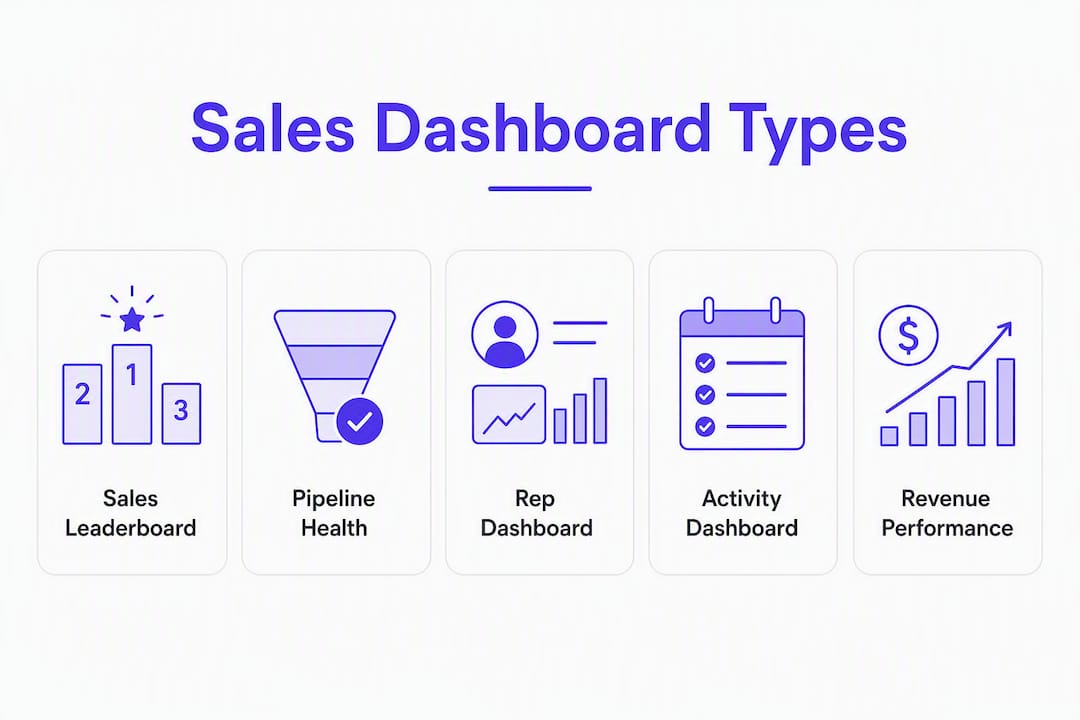
Not every dashboard serves the same purpose. Using the wrong type for the wrong audience is one of the fastest ways to create a screen nobody looks at.
Sales leaderboard. Shows ranked rep performance by calls made, deals closed, or revenue generated. Best audience: the whole sales floor. When displayed on an office TV, public transparency turns individual KPIs into team-level competition and can push daily activity rates up without a single manager conversation.
Pipeline health dashboard. Tracks total open pipeline value, stage-by-stage deal counts, and deals at risk of going stale. Best audience: sales managers and AEs who own quota. This is the view you check before a forecast call.

Rep dashboard. A personal view showing one rep's daily activity, open opportunities, and upcoming follow-ups. Best for individual contributors who want to self-manage without waiting for a manager check-in.
Activity dashboard. Focuses on leading indicators: calls made, emails sent, meetings booked, demos completed. Best audience: SDR teams and outbound managers. If revenue is the lagging outcome, this is the screen that tells you whether the inputs are there to produce it.
Revenue and product performance dashboard. Tracks closed revenue by product line, region, or rep segment. Best audience: sales leadership and revenue operations. Useful for spotting which products are moving and which are stalling mid-quarter.
When to use a TV wallboard vs. a personal dashboard
A TV wallboard works best for leaderboards and team-level activity metrics where social visibility drives behavior. Keep the layout simple: one or two large numbers per panel, high contrast, readable from across the room. A personal dashboard can carry more detail because the viewer is sitting close and has context. An executive rollup belongs on a desktop or in a weekly briefing, not on the office TV.
Pro Tip: For TV wallboards, limit each panel to a single metric displayed in a font size readable from at least 10 feet away. Dense multi-panel layouts defeat the purpose of public visibility.
Which KPIs belong on a real-time sales dashboard?
Effective dashboards focus on 5–7 core KPIs. More than that and the screen becomes noise. The goal is to show only the metrics that trigger an immediate decision when they move.
Here is a practical starting set, split by type:
| KPI | Category | Recommended refresh | Why it matters | Action trigger |
|---|---|---|---|---|
| Calls made today | Leading | 1–5 min | Shows whether reps are hitting daily activity targets | Below 50% of target by noon: check in with the rep |
| Meetings booked | Leading | 1–5 min | Predicts pipeline additions 2–4 weeks out | Drop of 20%+ vs. prior day: review call recordings |
| Open pipeline value | Lagging | 5–10 min | Indicates whether quota coverage is sufficient | Below 3x quota: escalate to manager |
| Deals at risk | Lagging | 5–10 min | Flags stalled deals before they fall out of the quarter | Any deal with no activity in 7+ days: assign follow-up |
| Win rate (rolling 30-day) | Lagging | Daily | Tracks conversion health over time | Drop of 5+ points: review recent lost deals |
| Closed revenue today | Lagging | 1–5 min | Tracks progress toward daily/weekly target | On pace or behind: adjust afternoon priorities |
| Follow-ups due | Leading | Real-time | Prevents callbacks from slipping | Any overdue: surface immediately on rep dashboard |
A practical design rule: place 2–3 leading indicators directly above the related lagging indicator on the same dashboard column. This creates a cause-and-effect chain. When calls made drops, you see pipeline coverage drop two weeks later in the same column, which makes the connection obvious to every rep who glances at the screen.
Reading live numbers without false alarms. A single bad hour does not mean a bad day. When a metric spikes or drops sharply, check whether it is a data-sync delay before acting. Set action triggers based on sustained movement (e.g., below target for two consecutive hours) rather than a single data point.
What does "real-time" actually mean for a sales dashboard?
"Real-time" gets used loosely. For sales teams, it does not mean sub-second streaming. Operational KPIs like call volume should refresh every 1–5 minutes; executive rollups can tolerate 10–15 minutes. Anything slower than 5 minutes for an operational metric is a fast report, not live monitoring.
Data sources that power a live dashboard
| Data source | KPI category it feeds | Typical latency |
|---|---|---|
| CRM (Salesforce, HubSpot, Pipedrive) | Pipeline, deals at risk, win rate | 1–5 min via direct API |
| Call tracker / telephony | Calls made, talk time, outcomes | 1–2 min via webhook |
| Calendar | Meetings booked, demos scheduled | 5–10 min via calendar API |
| Email platform | Email activity, open rates | 5–15 min via polling |
| Marketing automation | Leads created, MQL handoffs | 10–15 min via ETL |
| Billing / revenue system | Closed revenue, ARR | 5–10 min via API |
The fastest path to live data is a direct API or webhook connection. Many tools connect directly to Salesforce, HubSpot, and other major CRMs so numbers update within seconds of a CRM change. Polling (scheduled pulls every N minutes) is slower but simpler to set up. ETL pipelines are the slowest option and are better suited to executive rollups than operational dashboards.
Pro Tip: Sub-second streaming is overkill for most B2B sales teams. Unless you are processing thousands of events per minute, a 1–5 minute API poll delivers all the operational speed you need without the engineering overhead of a full streaming pipeline.
How do you build a real-time sales dashboard step by step?
This is a project, not an afternoon task. Here is a realistic sequence:
- Define purpose and audience. Decide who sees this dashboard and what decision it should trigger. A leaderboard for the sales floor and a pipeline view for the VP are different projects.
- Choose 5–7 KPIs. Use the table above as a starting point. Every KPI must have a named owner and a defined action trigger.
- Map your data sources. List every system that holds the data you need (CRM, call tracker, calendar). Confirm API access before committing to a timeline.
- Decide your refresh pattern. Operational metrics: 1–5 minutes. Pipeline and pipeline-adjacent: 5–10 minutes. Executive rollups: 10–15 minutes.
- Choose display surfaces. TV wallboard for team metrics, desktop or mobile for individual views, Slack alerts for threshold breaches.
- Prototype. Build a static mockup in a spreadsheet or design tool before connecting live data. Get stakeholder sign-off on layout and KPI selection.
- Pilot with one team. Run the live dashboard with a single team for two weeks. Collect feedback on which metrics they actually use.
- Iterate, then roll out. Remove metrics nobody acted on. Add any that came up in pilot feedback. Then deploy broadly.
Stakeholder sign-off checklist
- KPIs approved by sales leadership and sales ops
- Data source owners confirmed (CRM admin, IT)
- Refresh cadence agreed and technically feasible
- Display hardware ordered (if TV wallboard)
- Privacy and access controls reviewed
- Pilot team identified and briefed
Estimated timeline: Planning and KPI selection (1 week), data source mapping and API setup (1–2 weeks), prototype and design (1 week), pilot (2 weeks), rollout (1 week). Total: roughly 6–7 weeks for a team with existing CRM access and a dedicated ops resource.
Typical cost factors: Dashboard tooling subscriptions vary widely by feature set and team size. Display hardware for a TV wallboard runs $200–$600 per screen. Engineering time for custom API integrations is the largest variable cost for teams building from scratch. Off-the-shelf tools with native CRM connectors cut that cost significantly.
What design rules keep a sales dashboard actually useful?
The most common dashboard failure is not a technical one. It is a design one: too many metrics, too small to read, no clear signal about what to do next.
Rules that work:
- Keep it to 5–7 KPIs. Every metric beyond that competes for attention and dilutes the ones that matter.
- Size matters. The most important number on the screen should be the largest. If a rep has to squint to read their call count, the dashboard is not doing its job.
- Place leading indicators above lagging ones in the same column so the cause-and-effect relationship is visible at a glance.
- Use color deliberately. Red for below target, green for on or above, yellow for approaching a threshold. Do not use color for decoration.
- Set alert thresholds, not just displays. A dashboard that shows a number is passive. A dashboard that pings a manager when pipeline drops below 2.5x quota is active.
Common pitfalls to avoid:
- The data dump. If a metric does not trigger an immediate action, it creates noise that distracts the team from the KPIs that actually drive revenue. Cut it.
- Mixed time scales on the same view. Showing a daily call count next to a quarterly win rate on the same panel confuses the reader about what timeframe they are looking at.
- Over-refreshing non-critical KPIs. Refreshing a quarterly revenue chart every 60 seconds wastes API calls and creates the illusion of urgency where none exists.
- Alert fatigue. If every metric has an alert, no alert feels urgent. Reserve notifications for the two or three metrics where a threshold breach genuinely requires immediate action.
Pro Tip: For TV wallboards, use a dark background with high-contrast white or bright-colored text. Light backgrounds wash out under office lighting and are harder to read from a distance.
How do real-time dashboards change daily sales operations?
The operational shift is straightforward: managers stop spending their mornings pulling data and start spending them coaching.
Live monitoring. A manager who can see call volume by rep at 9:30 AM knows within the first hour whether the team is on pace. That is a fundamentally different starting point than reviewing a report at end of day.
Coaching in the moment. When a rep's activity drops mid-morning, a manager can pull up the call log, listen to a recent recording, and give feedback before the afternoon session. The coaching is specific, timely, and tied to real data rather than a vague "you need to make more calls" conversation.
Leaderboards and TV wallboards. Public displays change behavior. When reps can see their ranking relative to teammates in real time, many naturally push their activity up without any manager intervention. The effect is not universal, but it is consistent enough that most high-volume outbound teams use some form of public leaderboard.
Anomaly detection. A sudden drop in meetings booked, a spike in "not interested" outcomes, or a rep whose talk time has fallen to near zero are all signals that are invisible in a weekly report but obvious on a live dashboard. Catching these early is the difference between a recoverable dip and a missed quarter.
What security and privacy considerations apply to real-time sales data?
Real-time dashboards aggregate sensitive data: individual rep performance, deal values, customer names, and call outcomes. That creates real exposure if access controls are not set up carefully.
Role-based access is the baseline requirement. Reps should see their own data and team-level aggregates. Managers see their team. Executives see rollups. Nobody outside the sales organization should have access to individual rep metrics or deal-level data without a specific business reason.
Data in transit should be encrypted. Any dashboard that pulls live data via API should use HTTPS/TLS connections. If your dashboard tool does not enforce this by default, that is a red flag.
Third-party integrations introduce risk. Every tool you connect to your CRM is a potential data exposure point. Audit the permissions each integration requests. A dashboard tool that asks for write access to your CRM when it only needs read access is requesting more than it needs.
Compliance considerations depend on your industry and customer base. Teams handling financial services data, healthcare-adjacent information, or customers in states with active privacy laws (California's CCPA, for example) need to confirm that their dashboard tool's data handling meets those requirements. This is general guidance, not legal advice. Confirm your specific obligations with a qualified compliance professional.
Data retention on dashboard platforms is often overlooked. Check how long your dashboard tool stores raw event data and whether that storage period aligns with your company's data retention policy.
What makes data refresh and synchronization hard in practice?
The gap between "real-time" in a vendor's marketing and real-time in production is often wider than expected.
Clock skew. When data comes from multiple sources (CRM, call tracker, calendar), each system has its own timestamp. A call logged at 10:02 AM in your call tracker may not appear in the CRM until 10:04 AM after the sync. On a dashboard that shows both, the numbers can appear inconsistent for a two-minute window. This is normal, but it confuses reps who notice the discrepancy.
API rate limits. Most CRM APIs cap the number of requests per minute. A dashboard polling 20 metrics every 60 seconds can hit those limits, causing some metrics to update on a delay. The fix is to batch requests or use webhook-based push updates instead of polling.
Partial updates. If a rep closes a deal and the CRM sync runs mid-update, the dashboard may briefly show the deal in two stages simultaneously. Building idempotent update logic (so a duplicate event does not double-count a metric) is a small but important engineering detail.
Offline reps. Field reps who log calls on mobile while offline create a sync gap. When they reconnect, a batch of activity hits the dashboard at once, creating a spike that looks like an anomaly. Labeling batch-synced data differently from live data prevents false alarms.
The practical solution for most teams is to set honest expectations: operational metrics refresh every 1–5 minutes, and that is good enough for same-day decisions. Sub-minute accuracy is rarely worth the engineering complexity it requires.
What does implementation actually cost and how long does it take?
The honest answer depends on three variables: whether you use an off-the-shelf tool or build custom, how many data sources you need to connect, and whether you have an in-house ops or engineering resource.
Off-the-shelf dashboard tools with native CRM connectors are the fastest path. Setup can take as little as a few hours for a basic leaderboard connected to a single CRM. A more complete deployment covering multiple data sources, custom KPIs, and TV wallboard configuration typically takes 2–4 weeks.
Custom-built dashboards require engineering time for API integrations, data modeling, and front-end development. A realistic timeline for a custom build is 6–12 weeks, with ongoing maintenance costs that off-the-shelf tools absorb in their subscription price.
Hardware costs for TV wallboards are straightforward: a standard commercial display runs $200–$600, and most dashboard tools support Chromecast or a dedicated browser tab for display. That is a one-time cost.
Subscription costs for dashboard tooling vary by feature tier and team size. Entry-level plans for small teams are typically available for under $50/month. Enterprise tiers with advanced integrations, SSO, and dedicated support run significantly higher.
The most common budget mistake is underestimating the time cost of data source mapping and stakeholder alignment. The technology is rarely the bottleneck. Getting agreement on which 5–7 KPIs to show, and who owns each one, usually takes longer than the technical setup.
Key Takeaways
A real-time sales dashboard gives managers and reps the live visibility they need to coach, correct, and close faster, with 5–7 curated KPIs refreshing every 1–5 minutes as the operational standard. Implementing real-time dashboards typically delivers a 28–30% improvement in forecast accuracy and saves 15–20 hours per week on manual reporting, according to industry analysis.
| Point | Details |
|---|---|
| Define purpose before building | Decide who sees the dashboard and what decision it should trigger before choosing any tool or metric. |
| Limit to 5–7 KPIs | More metrics create noise; every KPI on the screen must have a named action trigger when it moves. |
| Match refresh rate to KPI type | Operational metrics (calls, meetings) need 1–5 minute refresh; executive rollups can tolerate 10–15 minutes. |
| Lead with leading indicators | Place activity metrics above revenue metrics in the same column to surface cause-and-effect relationships early. |
| Dialedsales for outbound teams | Dialedsales delivers live call logging, real-time leaderboards, and per-rep stats with no complex setup required. |
The dashboard most teams build is the wrong one
Most sales teams build their first real-time dashboard by asking "what data do we have?" instead of "what decision does this screen need to trigger?" The result is a 15-metric panel that looks impressive in a demo and gets ignored by the third week of use.
The teams that get lasting value from live dashboards do one thing differently: they start with the coaching conversation they want to have, then work backward to the two or three numbers that would tell a manager whether that conversation is needed today. Everything else is a drill-in, not a headline metric.
The other underrated factor is placement. A dashboard nobody sees is a dashboard nobody uses. Putting a leaderboard on the office TV is not a vanity move. It is the fastest behavior-change lever available to a sales manager short of standing over someone's desk. Public visibility creates accountability without a single conversation.
For outbound teams specifically, the metrics that matter most are the ones closest to the phone: calls made, talk time, and follow-ups due. Those three numbers, refreshed every few minutes and visible to the whole team, will tell you more about whether you are going to hit your number than any pipeline chart built from last week's CRM export.
Dialedsales gives your team live call and pipeline visibility today
If you have been tracking calls in a spreadsheet or waiting for end-of-day reports, Dialedsales is the faster path to a live sales dashboard your whole team will actually use.
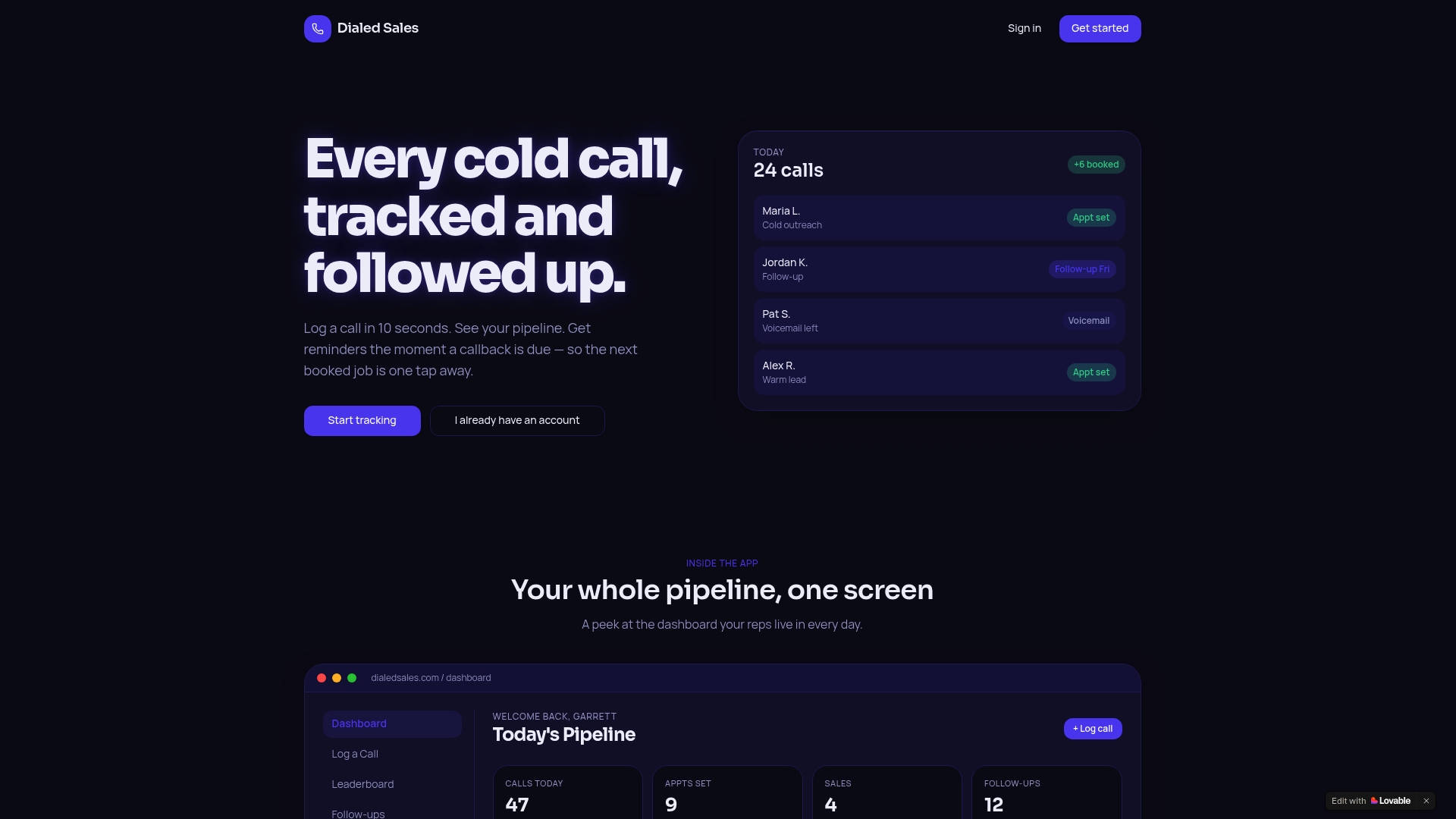
Log a call in 10 seconds, and it appears on your dashboard immediately: customer name, outcome, notes, and a follow-up date that surfaces automatically when it is due. The real-time leaderboard shows every rep's activity as it happens, so managers can coach in the moment instead of reviewing stale data. Per-rep stats, pipeline visibility, and an AI assistant for activity summaries are all built in, with no CRM integration required to get started.
Dialedsales runs on iPhone, Android, and desktop, so field reps and office teams see the same live view. The two-week free trial gives your team enough time to run a real pilot. Start your free trial and have a live dashboard running before your next team meeting.
Useful sources and templates
- What Is a Real-Time Dashboard? — Jaspersoft: Conceptual overview of real-time dashboard architecture; useful for understanding technical foundations.
- Sales Dashboard Guide: Metrics, Benchmarks & Design — Improvado: Deep dive into KPI design, leading vs. lagging indicators, and the data-dump pitfall.
- Sales Activity Metrics That Matter for Cold Callers — Dialedsales Blog: Identifies which outbound activity metrics belong on a live dashboard.
- Types of Sales Tracking Tools for Cold-Call and Field Reps — Dialedsales Blog: Compares tracking tool categories to help teams choose the right data source for their dashboard.
- The Role of Data in Sales Decisions — Dialedsales Blog: Guidance on KPI selection and avoiding metric noise in dashboard design.
- Sales Pipeline Visibility Explained — Dialedsales Blog: Covers pipeline-visibility techniques and how to surface pipeline health on shared dashboards.