
Every cold-calling team needs a dashboard because it converts raw activity into predictive, coachable signals that managers can act on before the month is already lost. Without one, you are managing on gut feel and end-of-period surprises. With one, you spot a list-quality problem or a script failure in days, not weeks. Teams that shift to a leading-indicator focus solve performance bottlenecks earlier and see measurable improvement in hitting monthly targets. The leading indicators that matter most are call volume, connect rate, and meaningful conversation rate. Dialedsales is built around exactly this workflow: log a call in 10 seconds, watch your pipeline update live, and get callback reminders the moment they are due. By the end of this article, you will know which metrics to track, how to set up a pilot, and how to use a dashboard to coach your team in real time.
Table of Contents
- What KPIs should cold callers track on a dashboard?
- How dashboards actually change cold-calling performance
- What features does a cold-calling dashboard actually need?
- How to set up a cold-calling dashboard: a step-by-step checklist
- How managers and reps should use the dashboard every day
- Common dashboard mistakes that kill performance visibility
- A sample dashboard template you can copy today
- Key Takeaways
- The metric that actually tells you what is wrong
- Dialedsales gives you the dashboard your team needs
- Cited sources and further reading
What KPIs should cold callers track on a dashboard?
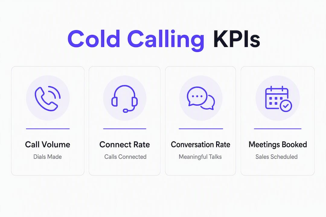
The metrics you choose determine whether your dashboard is a control panel or a vanity display. Call volume, connection rate, and meaningful conversation rate are the three leading indicators that belong on the top row of any cold-calling dashboard. Everything else is context.
The core KPI table
| KPI | What it measures | Why it matters | Practical benchmark |
|---|---|---|---|
| Call volume | Total dials per rep per day | Sets the activity floor; too low and nothing else matters | For high-volume outbound, 50–80 dials per rep per day is a common benchmark |
| Connect rate | Calls answered / total dials | Signals list quality and dialing strategy | Connect rates typically range from 4% (if lists are poor or mostly main-line numbers) to 12% or above (with high-quality, direct-dial data) |
| Meaningful conversation rate | Substantive conversations / connects | Separates real engagement from hang-ups | A meaningful conversation rate around 18–30% of connects is common; set your plan against initial team data |
| Meetings booked per call | Booked meetings per call | Ties activity directly to pipeline | For cold outbound, meetings booked per call usually land between 1–3% depending on list quality and industry |
| Call-to-meeting conversion | Meetings booked / total calls | Overall campaign efficiency | Cold call-to-meeting conversion rates are often under 3%, while warm leads convert at higher rates |
| Callback success rate | Callbacks that reach the prospect | Measures follow-up execution | A substantial portion of scheduled callbacks are successful; benchmark in your own data |
| Average call duration | Mean talk time per call | Short calls often mean early hang-ups; very long calls may signal qualification issues | Productive cold conversations usually last 2–4 minutes on average |
| No-show rate | No-shows / meetings booked | Flags qualification or scheduling problems | No-show rates below 30% are generally considered healthy |
| Pipeline generated | Estimated deal value from booked meetings | Connects activity to revenue | Set by your average deal size and close rate |
| Direct-dial hit rate | Direct dials reached / total dials | Low connect rates often trace to main-line calling, not rep skill | Track alongside connect rate to isolate data quality |

The top-row leading indicators
Three metrics belong on the front row of your dashboard, visible at all times:
- Call volume — the activity floor. If this drops, everything downstream drops with it.
- Connect rate — the first quality signal. A sudden dip usually means a list problem, not a rep problem.
- Meaningful conversation rate — the engagement signal. This is where script quality and rep skill show up.
Pro Tip: Adapt every benchmark above to your industry and list source. A solar sales team dialing purchased lists will see different connect rates than an insurance rep working warm referrals. Set your own baseline in the first two weeks of a pilot, then measure against that.
A note on cold-calling success rates: averages vary widely by industry, list quality, and time of day. Use industry benchmarks as a starting point, then let your own data set the real target within four weeks.
How dashboards actually change cold-calling performance
The core problem with managing a cold-calling team without a dashboard is that you are always looking backward. Revenue numbers, closed deals, and pipeline totals are lagging indicators. They tell you what happened, not what is about to happen. A dashboard built around leading indicators gives you in-flight control.
Here is the practical difference. Lagging indicators tell you that last month's pipeline was short. Leading indicators tell you on Tuesday that connect rates dropped 40% and you have time to fix it before Friday. That gap between knowing and acting is where most teams lose money.
Three use cases show how this plays out in practice:
List quality problem. A rep's call volume is high but connect rate sits at 3%. That is almost never a rep skill issue. When connect rate is unusually low, the cause is frequently main-line calling or poor contact data, not the rep's opener. A dashboard surfaces this in a morning scan. Without one, you might spend two weeks coaching the wrong thing.
Script problem. Connect rate is healthy at 12%, but meaningful conversation rate is stuck at 18%. Prospects are picking up and hanging up fast. That pattern points to an opener or value proposition that is not landing. Pull two or three calls from that period, listen, and adjust the script. The dashboard told you where to look.
Rep skill gap. Two reps have identical call volume and connect rates, but one books three times as many meetings. The dashboard isolates that difference. Now you have a coaching conversation grounded in data, not opinion.
Pro Tip: When you display live metrics to reps, frame them as performance tools, not surveillance. Live visibility of call activity increases rep motivation when the team understands the numbers help them, not just their manager. Put the leaderboard on a shared screen and let reps own their own numbers.
What features does a cold-calling dashboard actually need?
Not every dashboard tool is built for high-volume outbound. A BI platform designed for quarterly revenue reviews will frustrate a rep who needs to log 80 calls a day. Here is what the feature set needs to look like.
Core feature requirements
| Feature | Why it matters | Minimum requirement |
|---|---|---|
| Real-time updates | Stale data means stale decisions | Activity metrics should refresh every 1–15 minutes; connect rate every 15 minutes |
| Quick call logging | Cumbersome logging kills adoption | 10-second flow: name, outcome, notes |
| Per-rep leaderboards | Drives accountability and healthy competition | Real-time, visible to the full team |
| Filters | Lets managers isolate problems fast | Campaign, rep, list, outcome, date range |
| Outcome/event definitions | Keeps data consistent across reps | Standardized taxonomy enforced at log time |
| CRM and dialer integration | Eliminates double entry and data gaps | Bidirectional sync with your primary CRM |
| Alerting and thresholds | Flags problems before they compound | Configurable per metric; triggers at defined drop % |
| Export and audit trail | Supports QA and reporting | CSV export; timestamped log history |
| AI summaries and notes | Reduces admin time after calls | Auto-generated activity summaries and draft follow-ups |
Layout and metric count
The primary dashboard view should show the primary dashboard view should limit metrics to a moderate number for clarity: three leading indicators, two lagging indicators, and one team-health metric. Everything else belongs on a secondary dashboard for deep analysis. More than nine metrics on the main view creates analysis paralysis. Managers stop reading the dashboard and start skimming past it.
For field reps, mobile usability is not optional. A rep logging calls from a parking lot needs the same 10-second flow on their phone as they get on desktop. Dialedsales runs on iPhone, Android, and desktop, which covers the full range of where outbound reps actually work.
Check out the types of sales tracking tools guide for a breakdown of when a lightweight tracker fits better than a full BI stack.
How to set up a cold-calling dashboard: a step-by-step checklist
Setup is where most teams stumble. They pick a tool, connect it to their CRM, and then realize three weeks later that half the reps are logging outcomes differently and the data is useless. The sequence below prevents that.
-
Define your outcome taxonomy first. Before anyone logs a single call, agree on what every outcome label means. "Not interested," "callback," "voicemail," "no answer," "meeting booked" — each one needs a shared definition. Inconsistent labels are the fastest way to corrupt a dashboard. See the cold call outcome tracking guide for a ready-made taxonomy.
-
Choose 5–9 primary KPIs. Start with the three leading indicators (call volume, connect rate, meaningful conversation rate), add two lagging metrics (meetings booked, pipeline generated), and one team-health metric (average response time or callback completion rate). Resist the urge to add more.
-
Map your data sources. List every system that touches call data: your dialer, CRM, calendar, and email. Decide which is the system of record and how data flows between them. Gaps here become gaps in your dashboard.
-
Design the layout before you build it. Top row: three leading indicators with use rolling averages over multiple days instead of daily snapshots to show trends more accurately. Middle section: pipeline and progression. Right column: leaderboard and team health. Bottom: contextual metrics like no-show rate and cost per lead.
-
Set thresholds and alerts. A 20% drop in daily call volume should trigger a manager check. Meaningful conversation rate below 30% should trigger a script review. Set these before launch so alerts are automatic, not manual.
-
Implement fast logging. Successful teams prioritize tools that allow for 10-second logging to keep adoption high. If logging takes two minutes, reps will batch it at end of day or skip it entirely. Either way, your dashboard breaks.
-
Train reps on the outcome taxonomy, not the tool. The tool is easy. The definitions are where confusion lives. Run a 30-minute session where reps log practice calls and you review whether they are using outcomes consistently.
-
Run a 2–4 week pilot with a small group. Pick 3–5 reps. Define success criteria upfront: adoption rate above 90%, data accuracy above 85%, and at least one coaching conversation triggered by dashboard data. Track those three numbers, not the sales results.
-
Validate data hygiene before expanding. Pull a sample of logged calls and compare them to dialer records. If more than 15% of calls are missing or miscategorized, fix the logging flow before rolling out to the full team.
Pilot plan snapshot:
- Weeks 1–2: Free trial period. Onboard pilot group, define taxonomy, set thresholds.
- Weeks 3–6: Live pilot. Track adoption, data accuracy, and coaching frequency.
- Week 7: Review results against success criteria. Expand or adjust.
Roles: one manager owns data quality, one team lead owns coaching cadence. Data quality issues account for 67% of real-time dashboard failures in the first 90 days, so assigning ownership early is not optional.
How managers and reps should use the dashboard every day
A dashboard that gets checked once a week is a report. A dashboard that shapes daily behavior is a control panel. The difference is cadence.
Daily: the 5–10 minute morning scan
Open the dashboard before the team starts dialing. Check the top row: call volume from yesterday, connect rate, and meaningful conversation rate. If any metric is below threshold, act before the day starts, not after.
Per-rep quick checks take another two minutes. Look for outliers in both directions. A rep with unusually high connect rate and low meaningful conversation rate needs a different conversation than a rep with low volume across the board.
Simple daily scorecards showing calls made, connection rate, meetings booked, and call-to-meeting percentage give you everything you need for a morning huddle. Keep it to five minutes. State what the numbers show, name one focus for the day, and let the team dial.
When a metric falls below threshold mid-day, the response depends on which metric dropped. Call volume drop: check tech and list access. Connect rate drop: check list quality and dialing time. Meaningful conversation rate drop: pull two calls and listen before the end of the day.

Weekly: the 30–45 minute team review
Once a week, go deeper. Listen to two or three calls together as a team. Review call-to-meeting rate and progression rates. Check follow-up completion: are callbacks being logged and executed, or are they sitting overdue?
Use this session to adjust one thing: the script, the list source, or the follow-up sequence. Trying to change three things at once makes it impossible to know what worked. The high-volume cold calling playbook covers how to structure these weekly reviews for teams running 50-plus dials per rep per day.
Monthly: the 60-minute strategic review
Monthly reviews are where you look at pipeline created, cost per lead, and no-show trends. This is also when you decide whether to change qualification criteria or shift campaign targeting. If no-show rate is climbing, the problem is usually upstream: either the qualification bar is too low or the meeting confirmation sequence is broken.
Common dashboard mistakes that kill performance visibility
Most dashboard problems are not tool problems. They are process problems that the tool makes visible.
- Too many metrics on the primary view. When managers see 20 numbers, they read none of them. Limit the main view to 7–9 metrics. Move everything else to a secondary tab.
- Overemphasizing lagging indicators. A dashboard built around closed revenue and pipeline totals tells you what happened last month. It does not help you fix this week. Move leading indicators to the top row.
- Incomplete call logs. If reps are not logging every call, the dashboard is lying to you. Enforce 10-second logging and audit weekly during the pilot.
- Inconsistent outcome definitions. When one rep logs "callback" for a voicemail and another logs "no answer," your callback success rate is meaningless. Standardize the taxonomy before launch and revisit it monthly.
- Dashboards that feel like surveillance. Reps who feel monitored rather than supported stop engaging with the tool. Frame every metric as a coaching input, not a performance review. The goal is to help reps improve, not to catch them underperforming.
- Missing integrations. A dashboard that does not connect to your dialer or CRM requires manual data entry. Manual entry means gaps. Gaps mean bad decisions. Map your integrations in step three of setup, not as an afterthought.
For each of these, the fix is usually simpler than it looks. Reduce visible metrics to 7–9. Enforce fast logging. Standardize your outcome taxonomy. Present metrics as coaching tools. Connect your systems before launch.
A sample dashboard template you can copy today
This layout is built for a team of 5–15 reps running high-volume outbound. Adjust thresholds to your own baseline after the first two weeks of data.
Dashboard layout
Top row (leading indicators, use rolling averages over multiple days instead of daily snapshots to show trends more accurately):
| Widget | Metric | Alert threshold | Triggered action |
|---|---|---|---|
| Call volume | Daily dials per rep | 20% drop from 7-day average | Manager checks tech access and list availability |
| Connect rate | Calls answered / total dials | Below 5% | Review list quality and dialing time windows |
| Meaningful conversation rate | Substantive conversations / connects | Below 30% | Pull 2–3 calls; schedule script review |
Middle section (pipeline view):
| Widget | Metric | Alert threshold | Triggered action |
|---|---|---|---|
| Pipeline created | Estimated value of booked meetings | below weekly target | Review qualification criteria |
| Progression rate | Meetings that advance to next stage | Below 40% | Check discovery call quality and ICP fit |
Right column:
| Widget | Metric | Notes |
|---|---|---|
| Team leaderboard | Meetings booked, ranked by rep | Real-time; visible to full team |
| Average response time | Time from callback due to callback logged | Flags reps who let reminders lapse |
Bottom row (contextual metrics):
| Widget | Metric | Review cadence |
|---|---|---|
| No-show rate | No-shows / meetings booked | Weekly |
| Cost per lead | Campaign spend / meetings booked | Monthly |
| Direct-dial hit rate | Direct dials reached / total dials | Weekly; use to isolate list quality from rep skill |
Keep the primary view to these 7–9 metrics. Secondary dashboards can hold call duration distributions, outcome breakdowns by list source, and rep-level trend lines.
Pro Tip: Use use rolling averages over multiple days instead of daily snapshots to show trends more accurately instead of daily snapshots for every top-row metric. A single bad day looks like a crisis on a daily chart. A 7-day average shows you the actual trend and prevents unnecessary firefighting.
Dialedsales maps directly to this layout. The live pipeline dashboard, per-rep activity stats, real-time leaderboard, and callback reminders cover the top row, middle section, and right column out of the box. The activity metrics guide walks through how to interpret each widget once your pilot data starts coming in.
Key Takeaways
Cold-calling dashboards work because they surface leading indicators early enough to act on, before the month's results are already locked in.
| Point | Details |
|---|---|
| Prioritize leading indicators | Call volume, connect rate, and meaningful conversation rate belong on the top row of every dashboard. |
| Keep the primary view tight | Limit the main dashboard to 7–9 metrics; more than that creates analysis paralysis and managers stop reading it. |
| Data hygiene is the foundation | Enforce 10-second call logging and standardize outcome definitions before launch, or the dashboard will mislead you. |
| Run a short pilot first | A 2–4 week pilot with 3–5 reps and clear success criteria (adoption rate, data accuracy) prevents a costly full-team rollout on bad data. |
| Dialedsales fits the checklist | Dialedsales covers fast logging, live leaderboards, per-rep stats, callback reminders, and AI summaries in a lightweight app built for outbound teams. |
The metric that actually tells you what is wrong
Most sales leaders I talk to have the same blind spot: they check pipeline and revenue every morning and wonder why they keep getting surprised at the end of the month. The answer is almost always that they are reading the wrong row of the dashboard. Revenue is the score. Connect rate and meaningful conversation rate are the game film. You cannot coach from the score.
The moment a team I worked with started reviewing connect rate in their daily huddle, they caught a list-quality problem inside a week. The list vendor had sent a batch of main-line numbers instead of direct dials. Connect rate dropped from 11% to 4% overnight. Without a dashboard showing that metric in real time, they would have spent two weeks coaching reps on their openers before someone finally pulled the data and found the real cause.
The cultural piece matters just as much. Reps who see a leaderboard and understand that the numbers exist to help them improve, not to justify a performance review, engage with the dashboard differently. They start checking their own connect rate before the manager does. That shift, from surveillance to self-coaching, is where dashboards actually pay off.
Dialedsales gives you the dashboard your team needs
If you have read this far, you know what a cold-calling dashboard needs to do: surface leading indicators in real time, make logging fast enough that reps actually do it, and give managers a coaching tool instead of a vanity report.
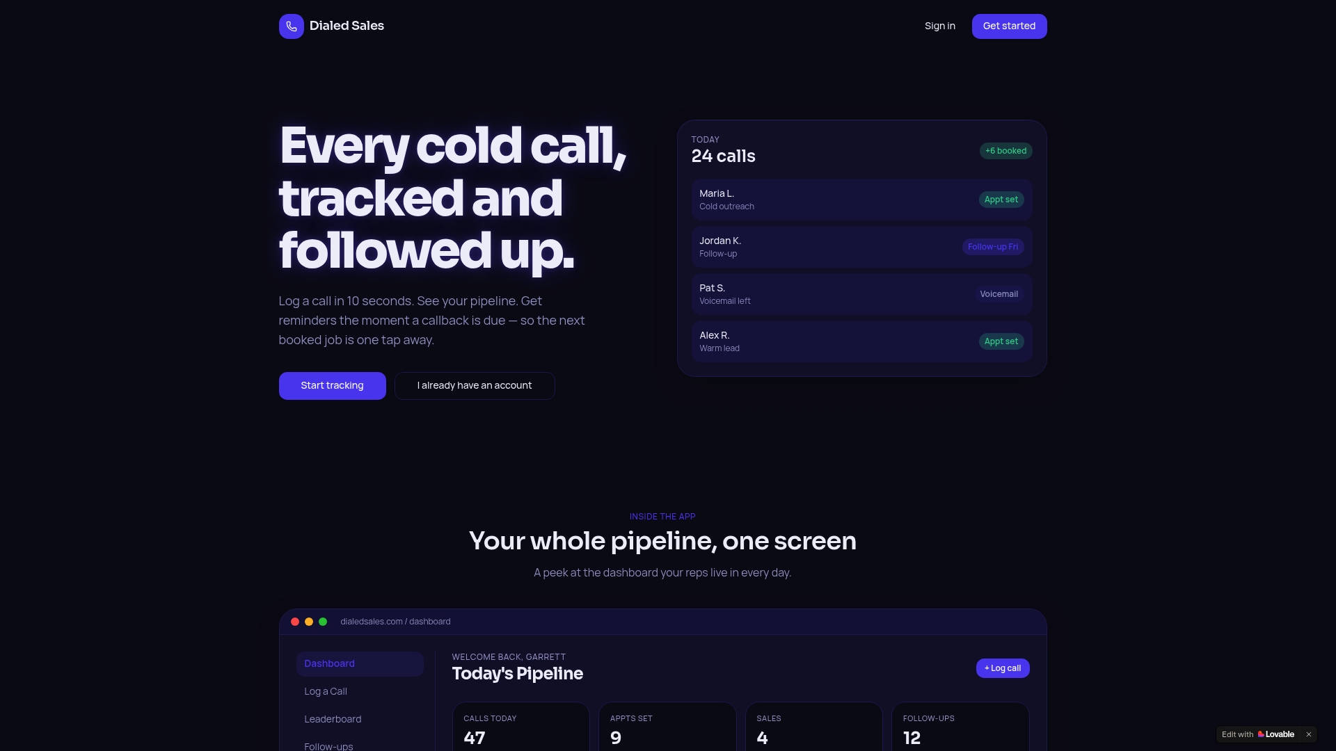
Dialedsales is built for exactly that workflow. Log a call in 10 seconds with the customer name, outcome, and notes. The live pipeline dashboard updates automatically. Callback reminders surface the moment a follow-up is due, so nothing falls through. Per-rep activity stats and a real-time leaderboard give managers the top-row view described in the sample template above. The built-in AI assistant drafts activity summaries and follow-up messages, cutting the admin time that usually kills rep adoption. It runs on iPhone, Android, and desktop, which means field reps and office teams work from the same data.
Getting started takes three steps: start a two-week free trial at Dialedsales, onboard a pilot group of 3–5 reps using the setup checklist in this article, and measure adoption rate and data accuracy at the end of week two. The trial requires a card for onboarding. If the data is clean and the team is logging consistently, expand to the full team in week three.
Cited sources and further reading
The benchmarks and implementation guidance in this article draw from practitioner-focused research on cold-calling KPIs, real-time dashboard design, and data hygiene requirements. The sources below cover the primary findings and are worth reading in full if you are building or evaluating a dashboard for your team.
- How to Track Cold Call Outcomes Effectively in 2026 — Dialedsales Blog
- Sales Activity Metrics That Matter for Cold Callers — Dialedsales Blog
- Cold Call Activity Tracking Methods for Sales Pros — Dialedsales Blog